Tokyo 2020 Olympics Logo Designer's works might be designs rip-offs. (2015-08-19)
Kenjiro Sano's works might be design rip-off.
Kenjiro Sano is the Tokyo 2020 Olympics Logo Designer.
This image is a hot topic in Japan.
"Out? Safe? Kenjiro Sano, a list of alleged design." (Source Unknown... from 2ch?)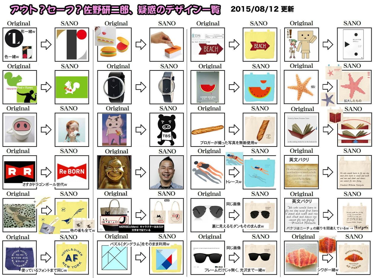
Tokyo 2020 Olympics Logo design might be a rip-off.
We didn’t care for Tokyo’s Olympics logo when it was unveiled earlier this week. Now, it appears that the design has a bigger problem than just uninspired design; it bears a striking similarity to another logo.
Designed by Kenjiro Sano, the 2020 Olympics logo features a rectangular pillar, with two triangles on its top and bottom. So does Studio Debie’s emblem for the Belgian Théâtre de Liège. There are differences: Debie’s version has white shapes set in a black circle, while Sano’s has gold, silver, and black forms as well as a rising red “sun.”
Tokyo's Uninspired Olympics Logo Might Be a Design Ripoff | WIRED
Suntory started gift campaign of tote bags by Kenjiro Sano' designs.
Suntory is a popular beverage manufacturer in Japan.
Gift campaign of tote bags by Suntory ALL FREE (non-alcoholic beer):
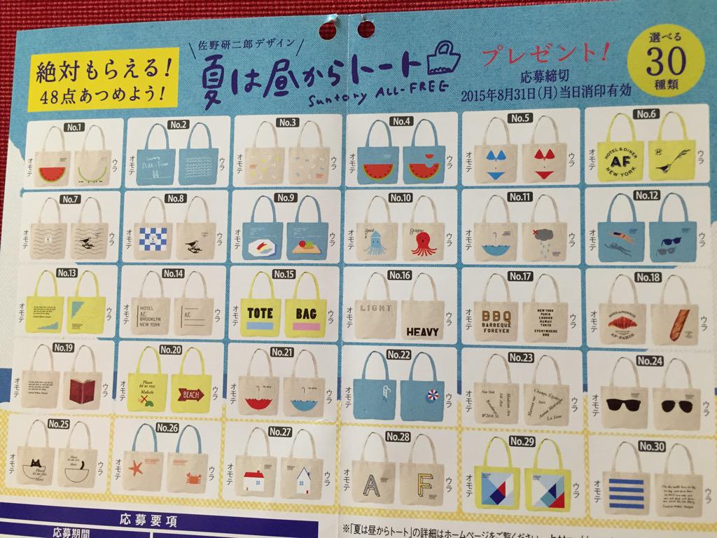
Some of these have been found to be rip-offs.
Suntory canceled some works. NO.6, 7, 8, 12, 18, 19, 20 and 24.
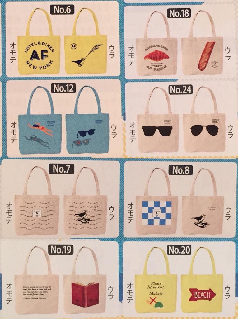
'List of designs stolen by "KENJIRO SANO" (Designer of the Tokyo 2020 Olympics Emblem)' (Source Unknown... from 2ch?)
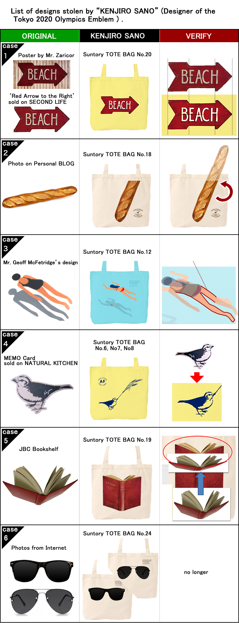
These works (NO.6, 7, 8, 12, 18, 19, 20 and 24) removed from Suntry's website.
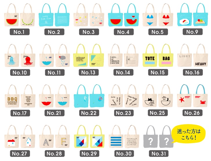
-> ALL FREE Summer tote bags gift campaign | Suntory (in Japanese)
Posted by NI-Lab. (@nilab)
